How Colour Psychology Shapes Classroom Environments & Student Learning

How Colour Psychology Shapes Classroom Environments & Student Learning

The colours used in a classroom can have a profound effect on student concentration, engagement, and emotional well-being. From calming blues that enhance focus to energising yellows that inspire creativity, understanding the psychology of colour can help educators create learning spaces that support student success.

Why colour matters in classrooms

Research shows that colour affects not just the look of a room, but how students feel and perform. Calming shades can help concentration; energising tones can spark creativity. The right colour strategy supports emotional well-being and creates an environment where learning thrives.

  • A 2021 study comparing classrooms painted in warm vs. cool hues found that “cold-hue” (cool) colours significantly improved attention and memory performance.1

  • Another recent review found that use of cool colours (particularly blue) supports emotional comfort and can contribute to neurophysiological relaxation.2

  • Schools that redesign classrooms - including colour, light, layout - have seen up to 16% improvement in learning progress3 (reading, writing, maths) over a year, compared to standard classrooms. 


How different colours influence mood, focus & learning

How different colours influence mood, focus & learning

Colours - depending on hue, brightness and saturation - send subtle signals to the brain and body. 

These signals influence emotional and cognitive states, meaning the right colour helps reinforce the purpose of each zone in a classroom.
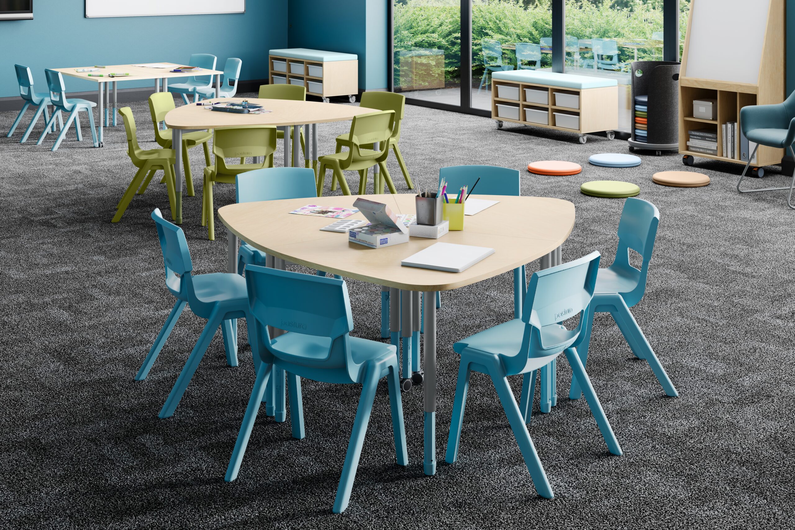
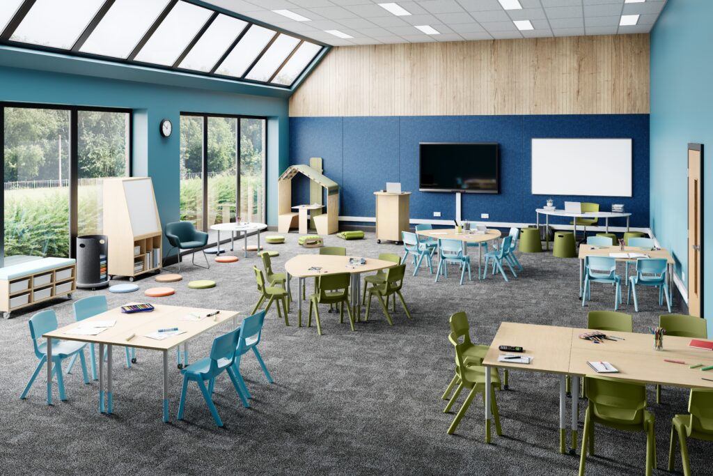
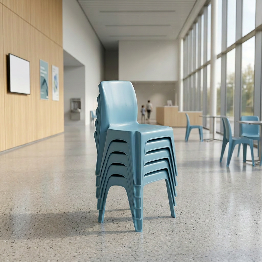
Blue & Green - calm, clarity, focus
Cool, natural tones such as blue or green support concentration, calmness and clarity - ideal for reading corners, study zones or individual work areas.
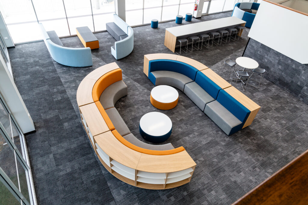

Yellow & Orange - energy and creativity
Warm accents like soft yellow or muted orange can energise discussion zones or creative corners, boosting enthusiasm, engagement and social learning.
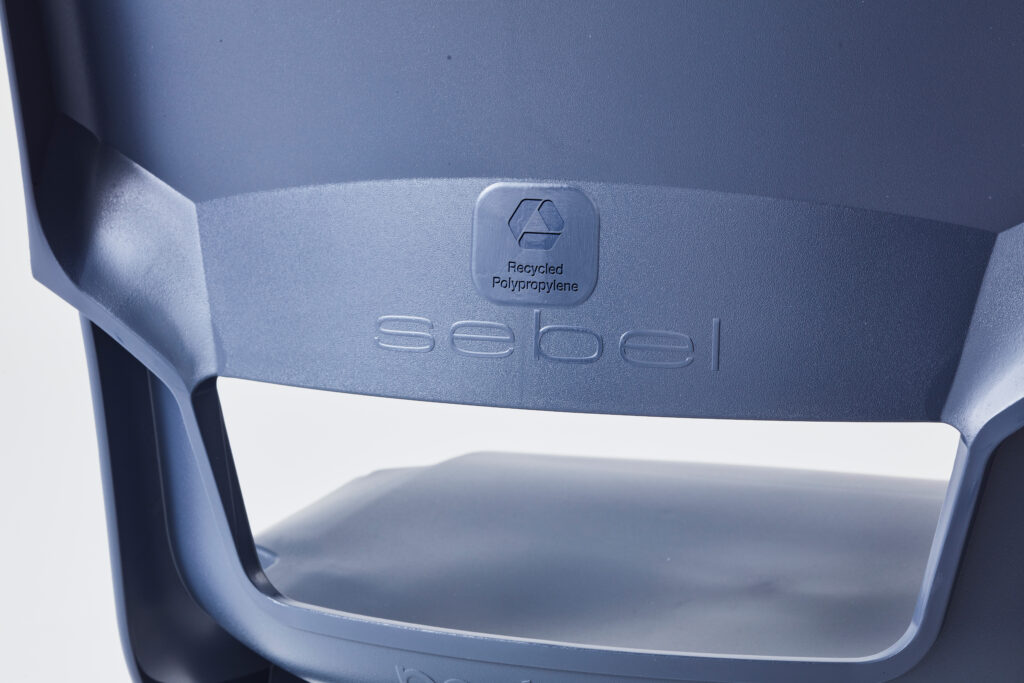

Charcoal & Navy - grounding and mature
Can promote confidence and focus when used sparingly. Use in senior classrooms, exam rooms, leadership/makerspace areas to add calm authority.


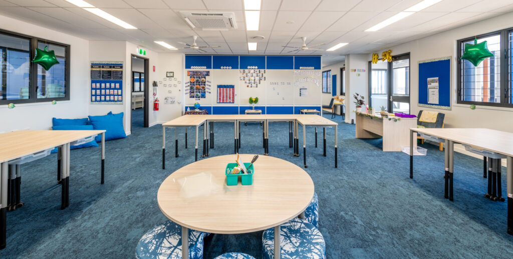
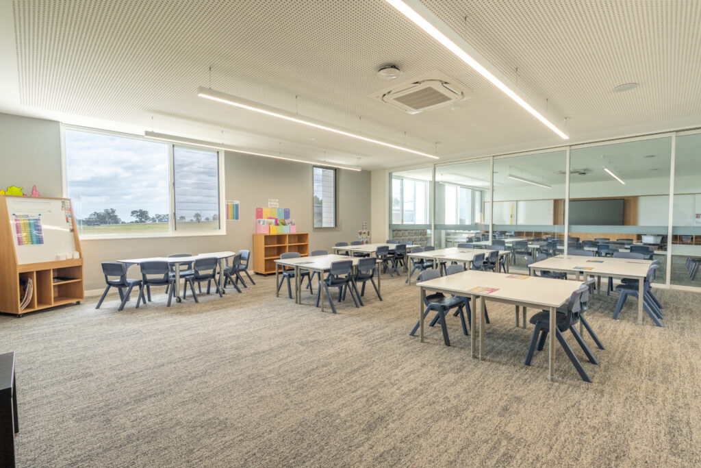
Neutral tones – calm, flexible backdrops
Off-white, light grey and natural beige tones lower visual noise and keep classrooms feeling open. Perfect as a base palette, allowing accent colours and furniture tones to shine.


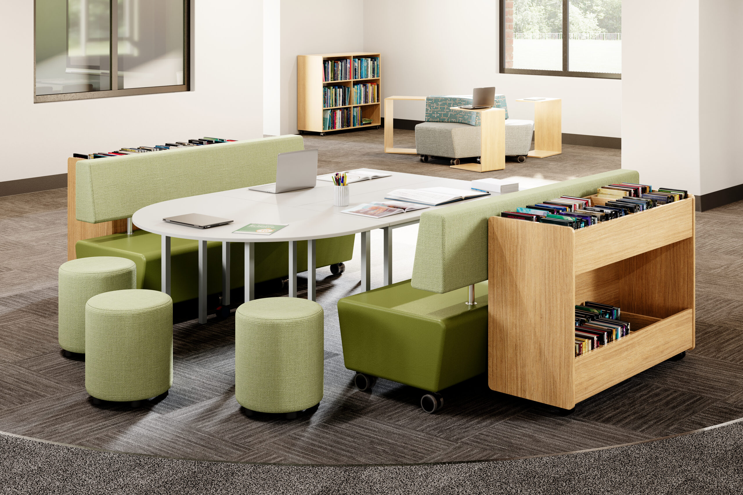
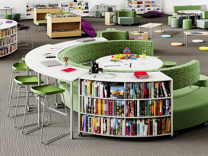
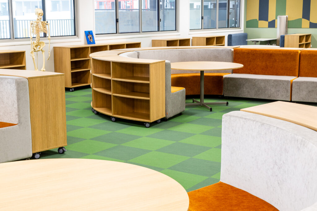
Biophilic Palette – grounding and emotional regulation
Colours drawn from the natural world (forest greens, stone greys, eucalyptus, sand, timber warmth) lower sensory stress and support wellbeing. Best for breakout spaces, transition zones and areas where students decompress or work independently.


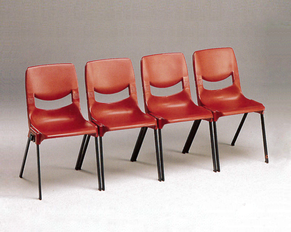
Red – stimulation and alertness
Red increases energy and draws attention, making it useful for quick visual cues or small highlight areas. Best used sparingly - too much red can feel overstimulating in classrooms.

Applying colour psychology through furniture: Sebel’s approach

Applying colour psychology through furniture: Sebel’s approach

  • Use calming green and blue tones (like our Recycled LUMBATM Chairs in Forest) for student desks or study zones to support focus and independent learning.

  • Keep large surfaces neutral (walls, shelving) to give flexibility - then use coloured furniture as accents or mood markers.


A biophilic palette - inspired by nature - brings a calm, grounded atmosphere into the classroom. Think forest greens, ocean blues, warm ambers and soft grey undertones. These shades are often associated with improved concentration, increased creativity and greater emotional ease.

Our Recycled Postura® Chairs and Twist’n’Lock™ Tables are available in biophilic colourways, ready to bring this calming palette into your learning spaces.

  • Introduce warm, energising hues (orange, yellow) like our NedTM Stool in Amber in social or group-learning zones - round tables, collaborative corners or breakout furniture.


  • Use furniture-based colour changes (chairs, soft seating, display units) rather than repaints - makes updates easier and accommodates evolving teaching styles
Understanding how we see colour

Understanding how we see colour

People usually see colour using three types of cones in the eye. Interestingly, some animals - and a small number of females - have four cones, which means they detect colours outside the range most people experience.


Colours fall broadly into two families:
Warm hues like red, orange and yellow feel active and energising.
Cool colours: blues (like our Recycled Postura Max Chairs® in Ocean), greens and lilacs, create a calmer, more balanced atmosphere.

Practical tips for planning your classroom colour scheme

  1. Map each zone to its purpose - quiet study, collaborative work, creative projects, relaxation - then choose colour palette accordingly (cool for focus, warm for energy)

  2. Use base + accent approach - neutral tones for major surfaces, stronger or coloured finishes for accents and smaller pieces.

  3. Leverage furniture colour for flexibility - easier to change than walls when the room’s use changes.

  4. Monitor saturation and brightness - subtle, soft tones work best for long-term use, while high-saturation colours are better as small accents.

  5. Balance colour with light, layout and furniture quality - colour works best as part of a holistic classroom design strategy, not in isolation. Research shows that when colour, light, furniture flexibility, ventilation and layout are optimised together, student performance improves significantly.


1. 'Cold and warm coloured classrooms. Effects on students’ attention and memory measured through psychological and neurophysiological responses'. Science Direct, 2021. 2. 'Neurophysiological and psychological effects of color and ceiling height in learning spaces'. Science Direct, 2025. 3. 'Well-designed classrooms can boost learning progress in primary school pupils by16%, new research reveals'. University of Salford Manchester', 2015.