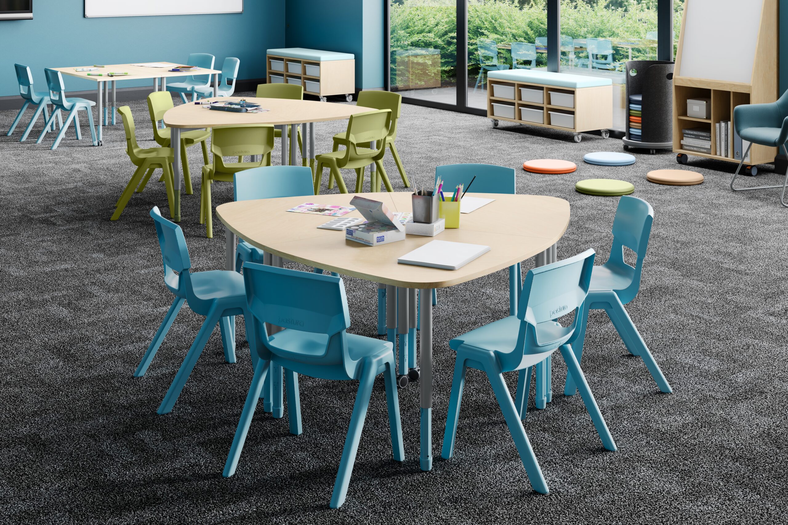
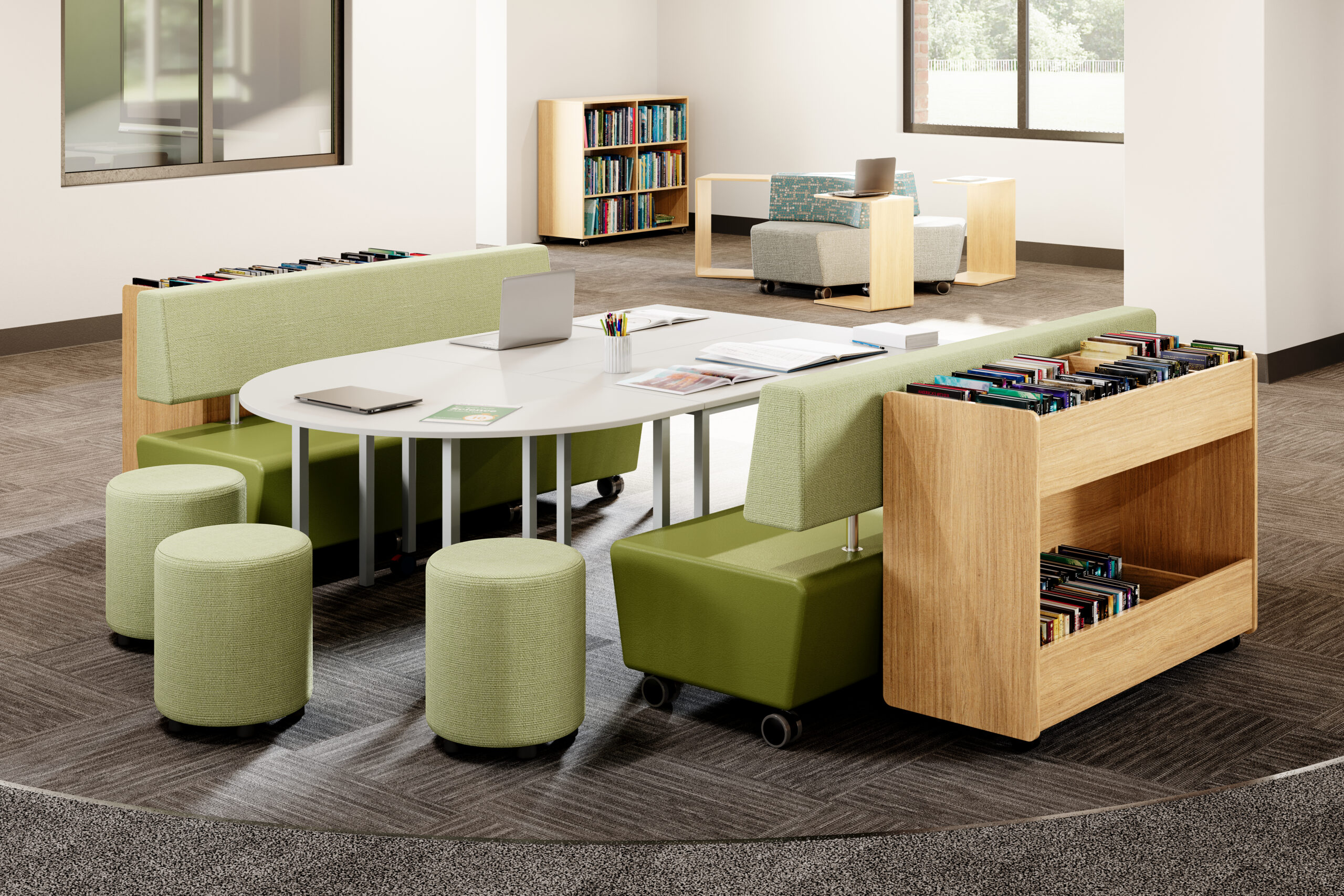
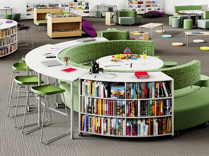
Colours – depending on hue, brightness and saturation – send subtle signals to the brain and body. These signals influence emotional and cognitive states, meaning the right colour helps reinforce the purpose of each zone in a classroom.
Blue & Green – calm, clarity, focus
Cool, natural tones such as blue or green support concentration, calmness and clarity – ideal for reading corners, study zones or individual work areas.
Yellow & Orange – energy and creativity
Warm accents like soft yellow or muted orange can energise discussion zones or creative corners, boosting enthusiasm, engagement and social learning.
Charcoal & Navy – grounding and mature
Can promote confidence and focus when used sparingly. Use in senior classrooms, exam rooms, leadership/makerspace areas to add calm authority.
Neutral tones – calm, flexible backdrops
Off-white, light grey and natural beige tones lower visual noise and keep classrooms feeling open. Perfect as a base palette, allowing accent colours and furniture tones to shine.
Biophilic Palette – grounding and emotional regulation
Colours drawn from the natural world (forest greens, stone greys, eucalyptus, sand, timber warmth) lower sensory stress and support wellbeing. Best for breakout spaces, transition zones and areas where students decompress or work independently.
Red – stimulation and alertness
Red increases energy and draws attention, making it useful for quick visual cues or small highlight areas. Best used sparingly – too much red can feel overstimulating in classrooms.