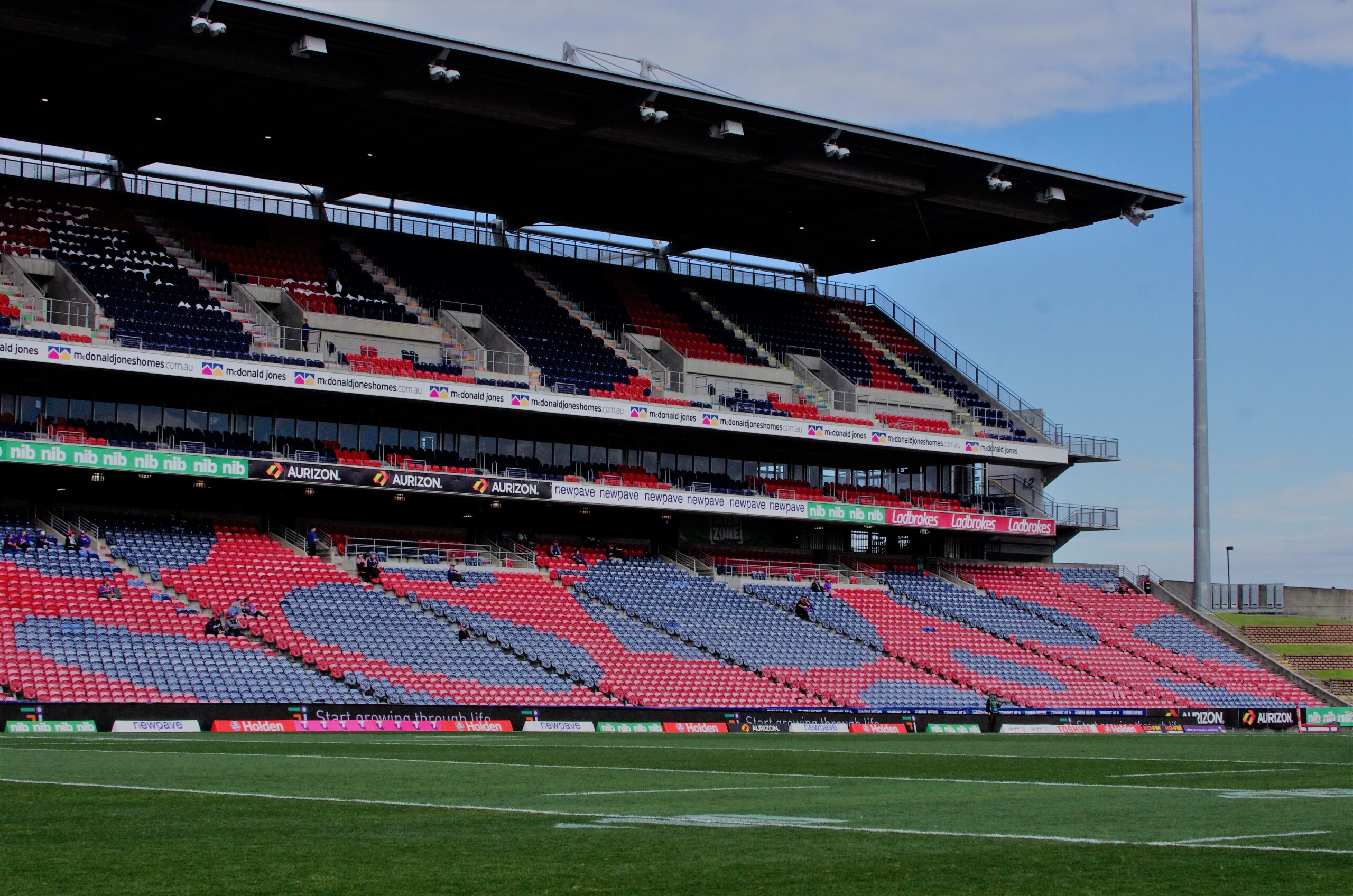
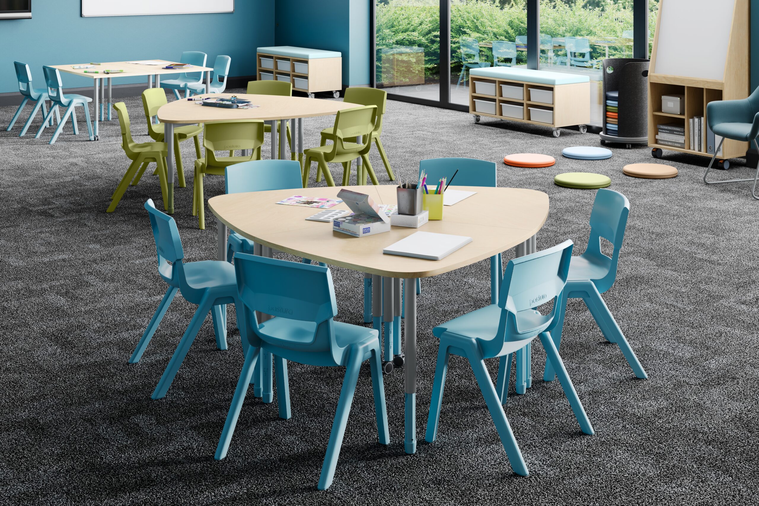
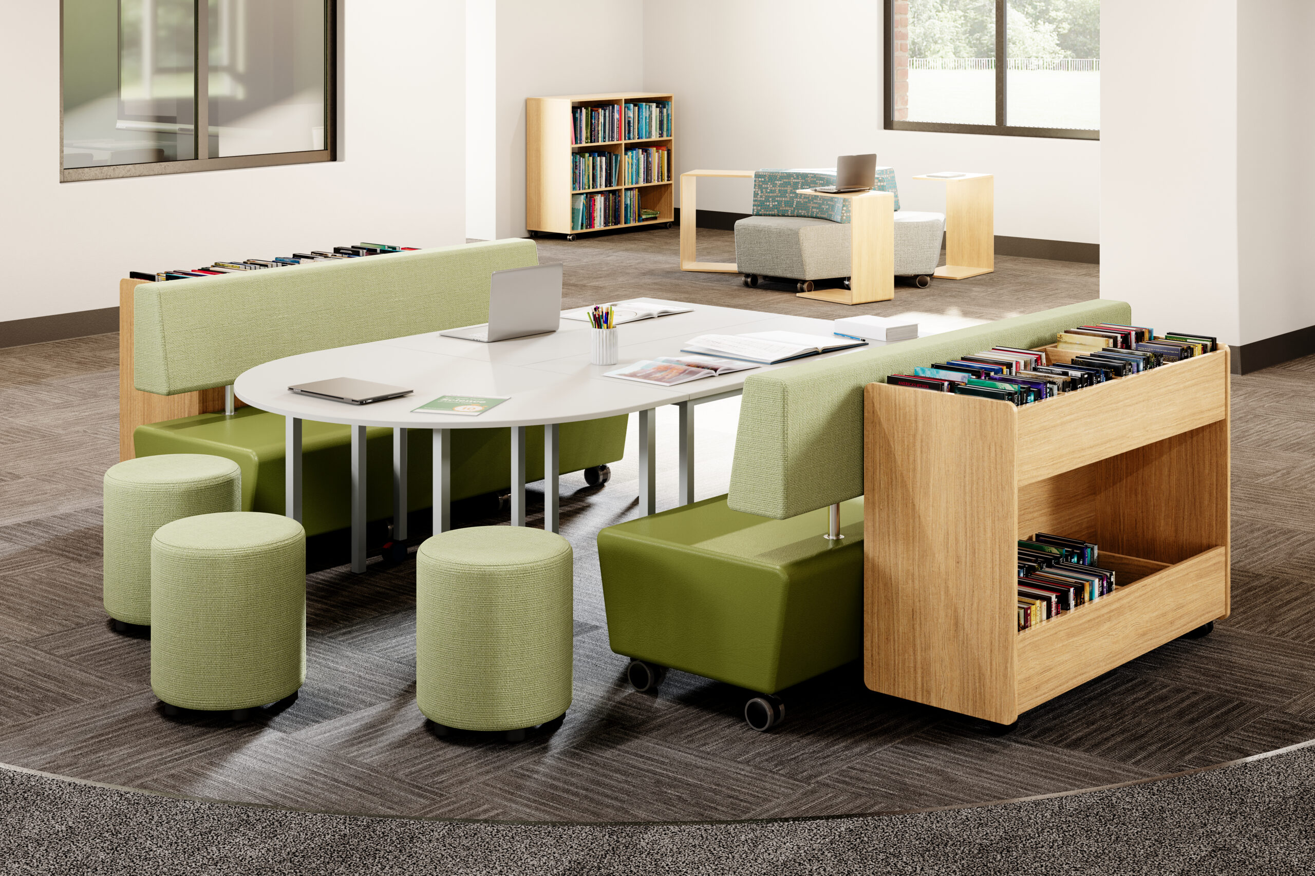
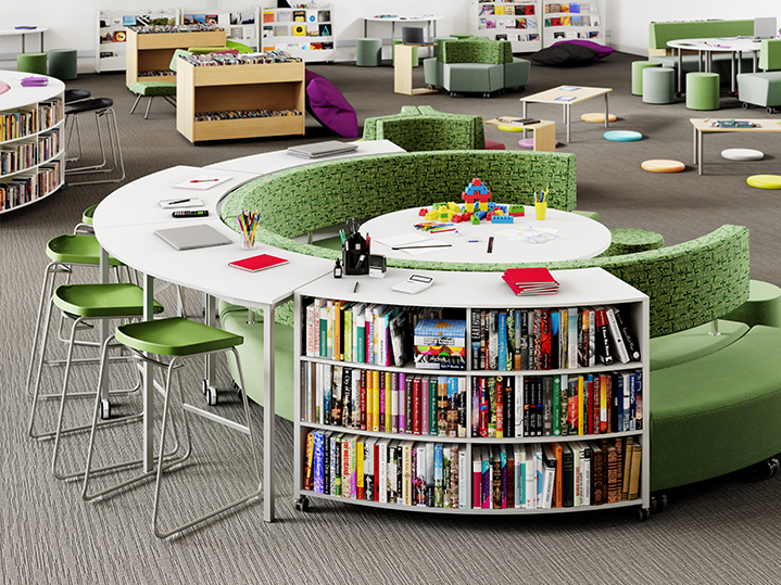
Furniture for education and public venues—comfortable, flexible and built to last.
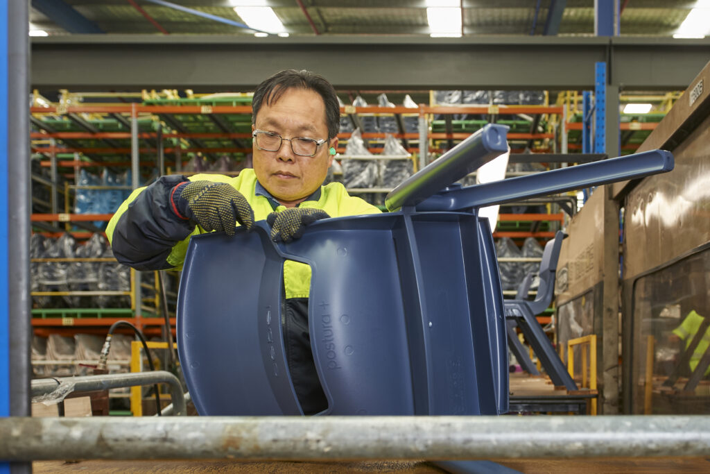
Australian-made furniture since 1951.
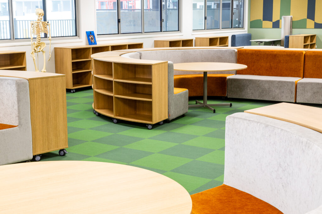
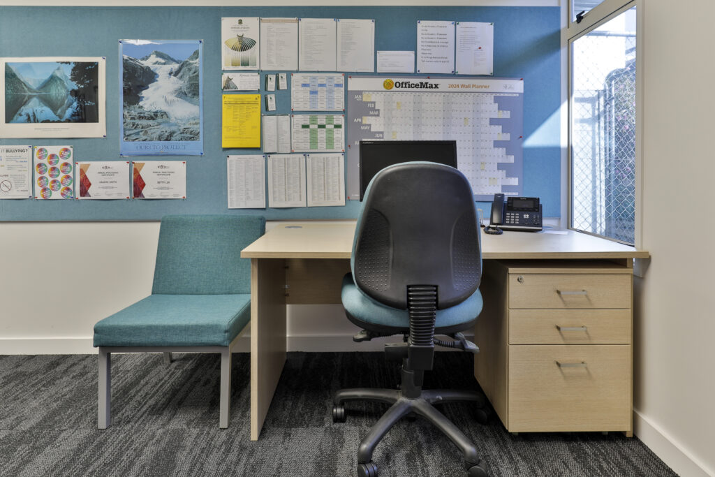
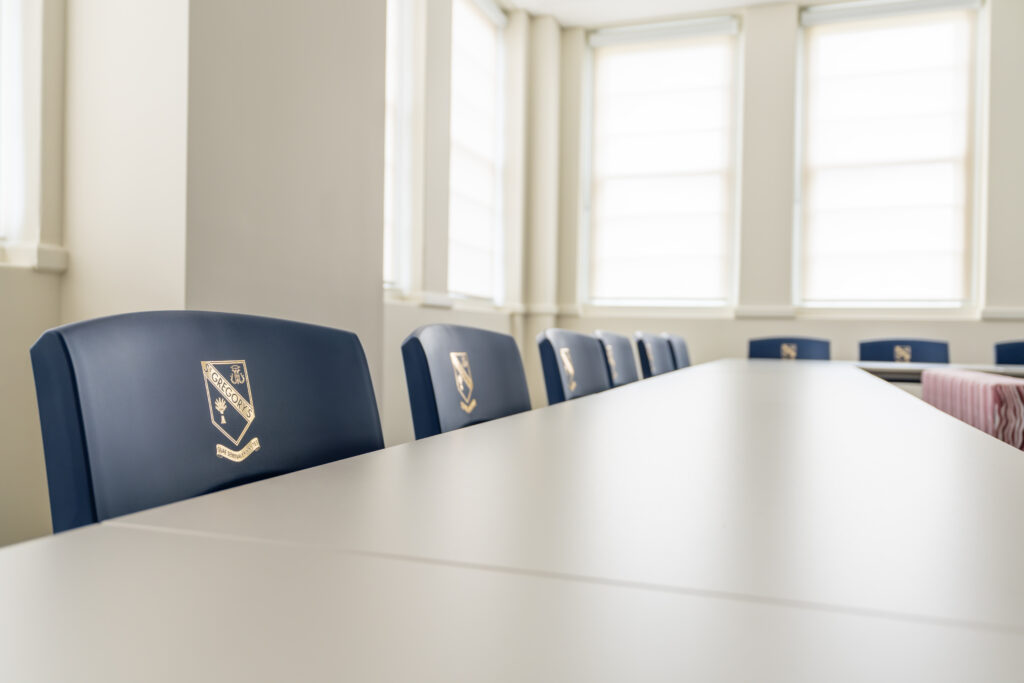
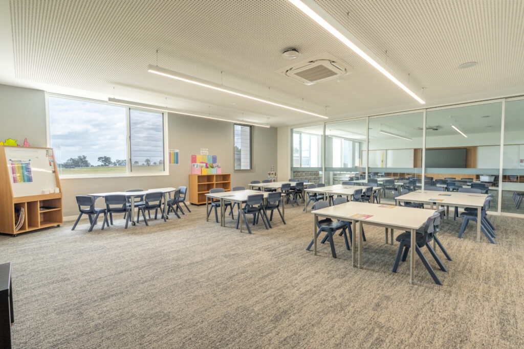
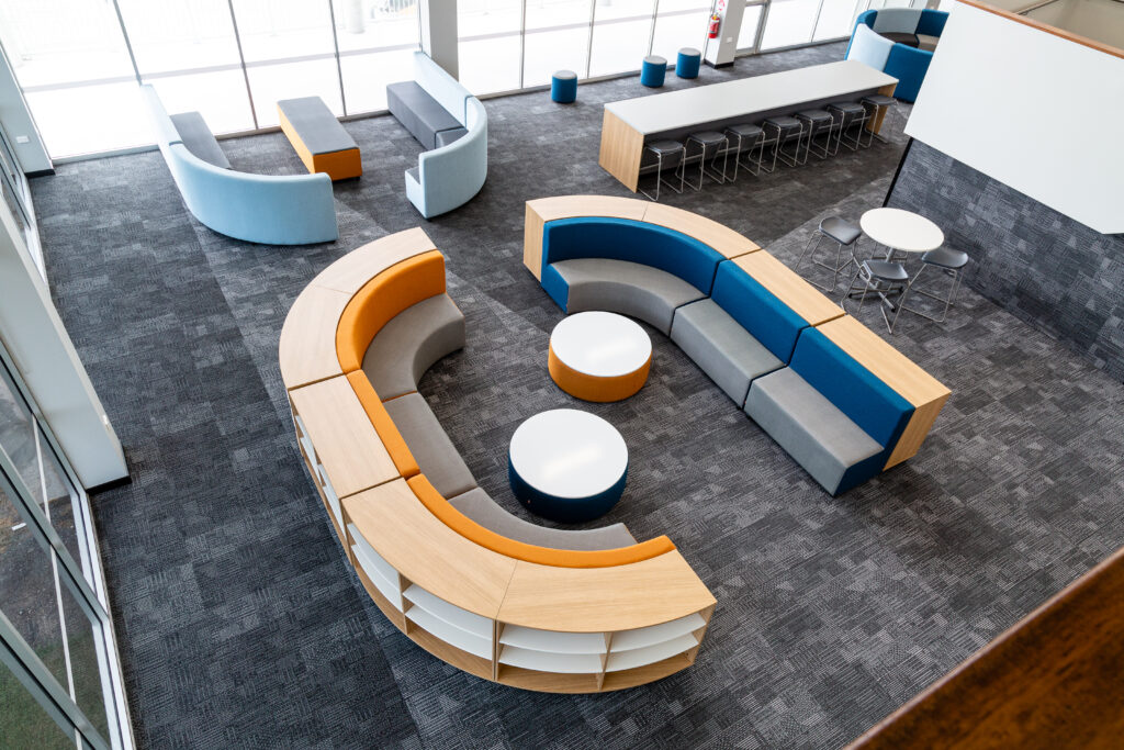
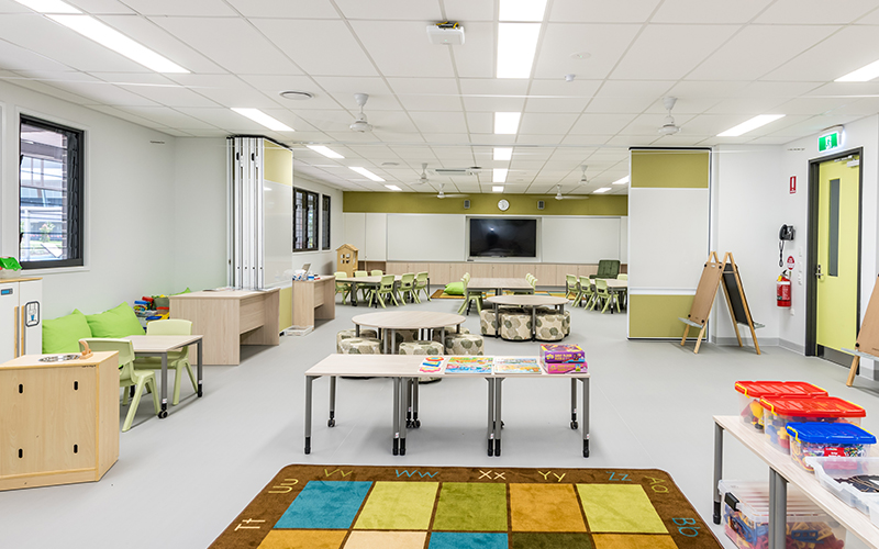
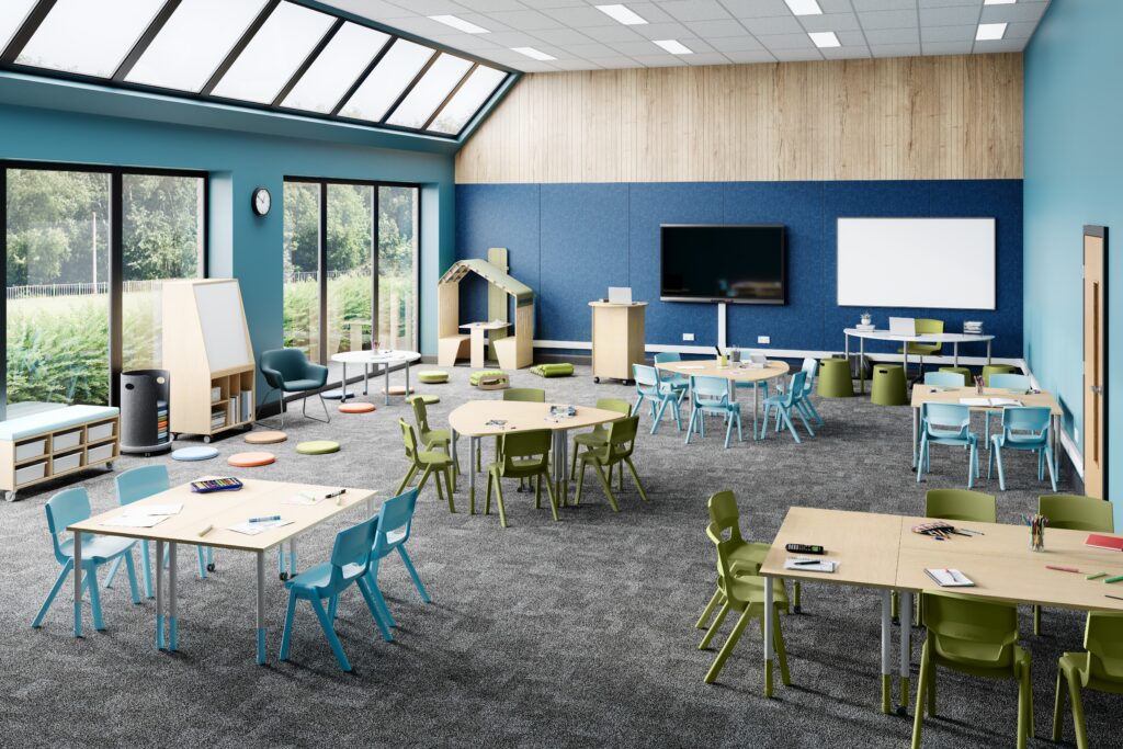
See Sebel products at work in a range of situations with inspiring case studies from some of our most exciting projects. Learn more about how our products work and browse helpful guides on designing spaces.